Pantone Color of the Year
February has just started, and if you are having the winter blues, Pantone has released its 2017 Color of the Year, so you can start to freshen up your home and blast away those winter blues. The color gurus at Pantone chose Greenery as the color that would epitomize 2017 because this yellow-green hue reflects new life, new leaves, and has calming properties. If you want to freshen up your home and get ready for spring, incorporating Greenery into your home will make your home feel brighter and lighter.
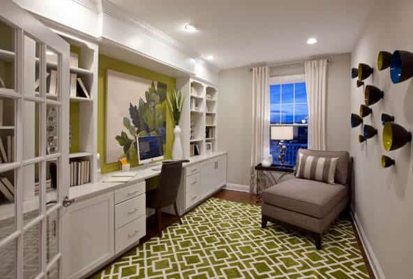
A brighter and more soothing color, Greenery is far from the avocado shade prevalent in 70s décor. It has fewer brown tones, and uses yellow tones to look cleaner. Shades of green have traditionally been used to create calming spaces, and Greenery is no exception. The yellow tones in the color lend a playful aspect to the spaces it is used in. The balance between Greenery’s playful and soothing sides make it a great color to use in all types of rooms and spaces from your dining room to your children’s play room.
Unlike heavily saturated warm colors – think bold reds, scorching pinks, bright oranges, and florescent yellows – Greenery won’t overwhelm a room, so you can use it as an accent color, or the main color of your walls. If you are ready to take the plunge with Greenery, and use it as the base of your color pallet in a room or in your home, Pantone provides numerous color swatches that show how people with all types of tastes can use Greenery in their home. For pops of Greenery, you can use it in your accent pillows or table lamps. One of the best ways to incorporate Greenery into your home is to use potted plants as decorative objects. If you want to use Greenery as a stronger accent, consider investing in furniture that incorporates greenery, or paint wood furniture in this lovely shade of green.
Featured photo by Lita Dirks & Company